Role
Product Designer
Duration
4 Weeks
Tools Used
Figma, FigJam, Canva, Google Docs
Luxury real estate websites often feel cluttered and overwhelming, making it difficult for users to explore properties clearly or trust the brand.
The Goal
Design a clean, responsive real estate website that makes browsing premium properties simple, elegant, and trustworthy.
What I Designed
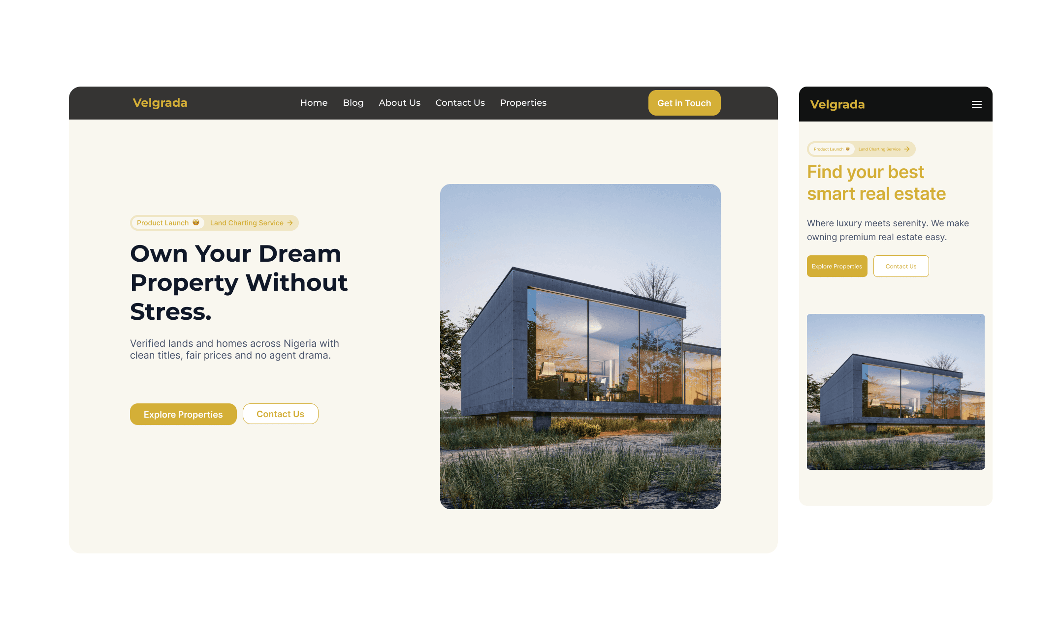
Desktop landing page
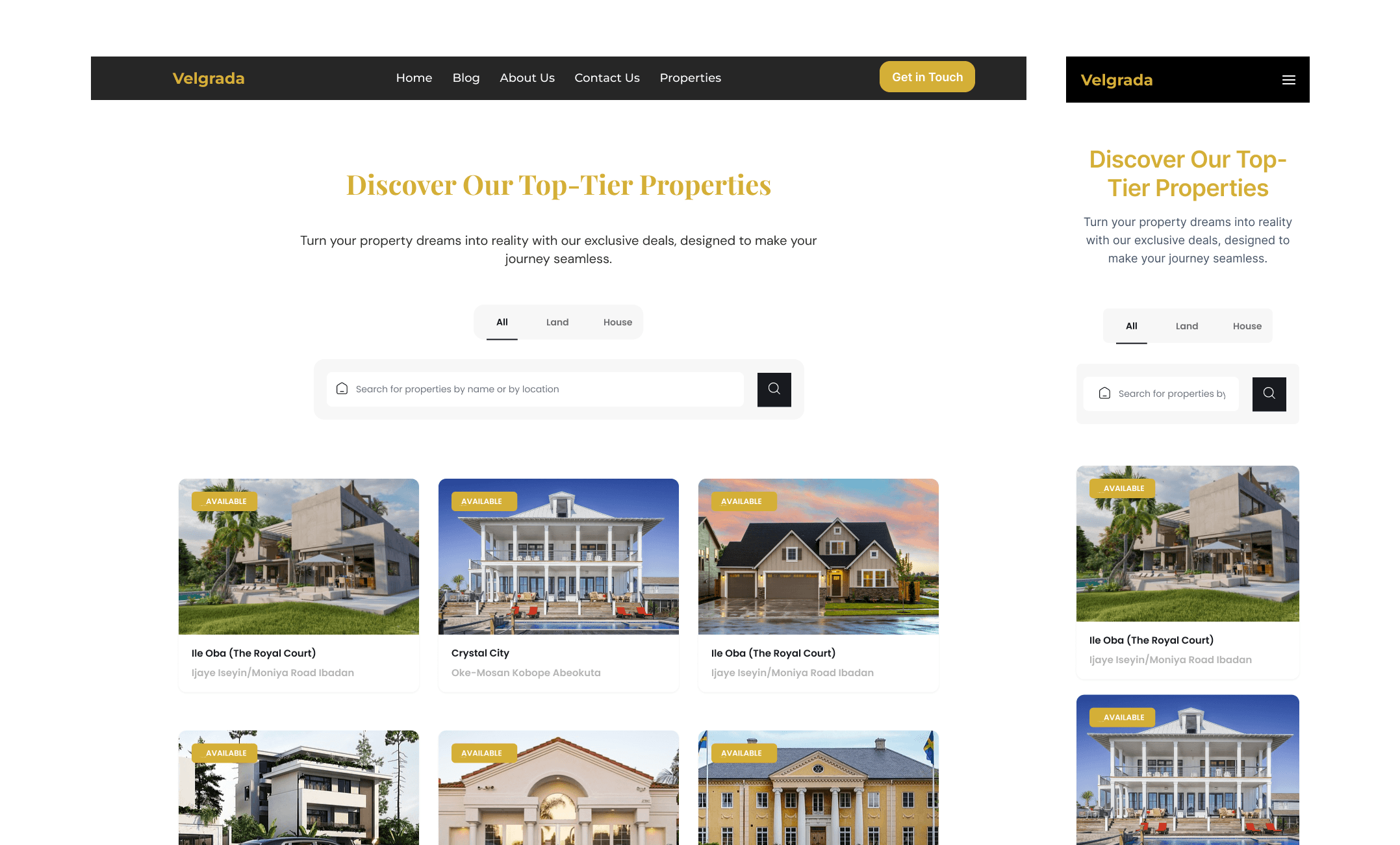
Properties listing page
About Us page
Contact Us page
Privacy Policy page
Mobile-responsive versions of the screens
Key UX Decisions
Simplified layout to reduce visual clutter
Clear content hierarchy for easy scanning
Large property imagery to build trust and emotional appeal
Consistent spacing and typography for readability
Responsive layouts optimized for mobile browsing
Design Process
Reviewed existing real estate platforms
Sketched layout and structure ideas
Created low-fidelity wireframes
Designed high-fidelity UI in Figma
Refined layouts for desktop and mobile responsiveness
Final Screens
Full desktop landing page (long scroll)
Supporting desktop pages (Properties, About, Contact, Privacy)
Mobile views for key sections
Competitive Analysis: I reviewed platforms such as PropertyPro, RealEstateMall, and global luxury sites like Sotheby’s International Realty. I observed that most lacked a clean structure and overwhelming content placement affected readability. This helped me refine Velgrada’s simple, premium direction.
SEPT Analysis (Social, Economic, Political, Technological):
Social: People rely heavily on digital platforms before contacting agents.
Economic: Luxury real estate requires strong digital branding to attract high-value buyers.
Political: Real estate transactions require transparency, so the platform must build trust.
Technological: Users expect fast loading, responsive design, and easy navigation.
Key Insights: Users want fewer distractions, clear property details, immediate access to listings, and strong visual trust signals such as clean layout, readable typography, and consistent brand styling.
User Research & Interviews: I conducted informal interviews and observations with five individuals experienced in searching for rentals or premium homes. Most struggled with confusing filters, inconsistent layouts, and overwhelming property pages. The insights shaped a clearer structure for Velgrada.
User Research Insights:
Users prefer:
simple navigation
large images
clean property information
a modern and trustworthy look
responsive design that adapts well on mobile
Personas: A typical persona is a 31-year-old young professional or investor seeking a seamless online experience to learn about properties, compare options, and contact agents without stress.
Empathy Map Summary: Users think about credibility, feel overwhelmed by clutter, say they want simplicity, and do tasks such as browsing listings, comparing images, and contacting agents.
Branding: Velgrada’s branding highlights luxury through gold accents, deep blue, charcoal tones, and premium white backgrounds. The typography is clean, elegant, and modern, reinforcing trust.
Conclusion: Velgrada’s website design successfully combines luxury aesthetics with functional UX principles. The final result is a modern, responsive, user-centered real estate experience that feels premium yet simple to navigate. The project strengthened my understanding of luxury branding, responsive layouts, and balancing aesthetics with usability.